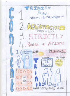
These magazine drafts which include content and cover pages, all have a house style running through them. The colour scheme and font have a pattern on each magazine. The title of the magazine is large and bold mainly in capital letters to stand out and be recognisable for the audience on the front cover, the title “content” is linked and placed in the same way to relate to the cover style. I have demonstrated different colours and relating them to their matching pages. The text font and size stereotypically change at different levels relation to my research. I have experimented with different colours and ways in which to set out my titles in. The websites, barcodes, dates and issue numbers are placed on every cover as part of my research I have realised that it is a very important element on a magazine. I have used a range of different font for by using, bold and italics. I have followed the conventions that the title of either the main story or the name of the magazine in the largest font. The cover story image is the largest on the page and spreads out across the largest area on the cover and content page. I have experimented with puffs and banner the intrigue the audience. My target audience is mainly 11-16 year old and for both genders as they attend secondary school although the main cover story can change the effect of the magazine by disiding the gender.
The key image of a male pirate, is more likely to attract a male audience because of the nature of the image although I have added a banner to advertise a story that is more likely to attract a female audience. I have mixed the genders to focus on to make it attract a wider target audience.
EVALUATION FOR PRELIM
My task was to produce a school magazine with a chosen target audience of my choice. I feel that my final design that I have produce include element of conventions that exist in past and present products. I had to research conventions and stereotypes to develop my final design. I looked at specific aspects of school magazine and other magazine that could influence key aspects and decisions that I had to make. The key aspect that sounds where included where; a mast head, a key image, and cover lines. I looked at content pages as well as cover pages, the conventions on a content page changes slightly but also linking with a house style relation to the cover page. A convention of a content page also has a key image and cover lines as the contents page is to help the audience know what the magazine contains. I used all of these features for my final development as it made my magazine and contents page more realistic and professional.
My target audience was mainly targeted at school pupils. I decided to have a school magazine that covered anything in schools; containing all interests to all subjects therefore it would have a wider target audience as all interests are provided in the magazine. The cover lines express this as they consist of different aspects to the audience either it being to do with drama, English or maths.
The institution that would distribute my magazine would be schools as I focused my magazine based around a school. Also the audience that I have aimed my media product to is 11-16 year old students as this is the particular age range that would most likely read my magazine, but also would interest parents and teacher of any age creating an even wider target audience. You can see that this chosen target audience is appropriate by the way the magazine has been presented as a consistent house style has been used of bright colour being; yellow, blue and black. This provides the presentation of the magazine to look bright and colourful engaging the audience also the house style is carried through to my contents page therefore it interests the audience much more. By having a key image of a happy student helps influence the age range as this reflects on the target audience as they would appeal to this young children would be attracted my an older student as a possible role model and people around that age can relate to her age also. As the contents page has one main insert images this influences the target audience to want to read on as they would want to find out more about that specific story.
The technologies that I have learnt for this particularly media product are helpful as the research and development shows that I have gone into depth in my research to gain a wider understanding of how certain magazines are to be presented this helped me for this task as existing magazine gave me a idea of stereotypes and conventions within the magazine genre. The existing magazines have inspiration and guided me showing me how my product should result in. I used Adobe InDesign to create my media product; I gained many new skills which I will use for my next task to create an indie rock music magazine.


